
THE FURREAL REBRAND
MY ROLE:
Lead Brand Designer / Art Direction
THE CHALLENGE:
Due to stagnation in the market, the FurReal brand became a candidate for a complete visual make-over. It didn’t just need minor tweaks, like the Peppa Pig project. It, like Furby, needed a completely new visual language system.
MY CONTRIBUTION:
Led the visual development and translated the strategic direction into a scalable visual system across all consumer touchpoints.
THE SCOPE:
Brand identity • Logo • Typography • Color palette & patterns • Illustration • Photography Direction • Packaging • Retail • E-commerce • Digital • Social • Experiential & Events • Marketing Campaigns • Licensed Consumer Products
THE RESULT:
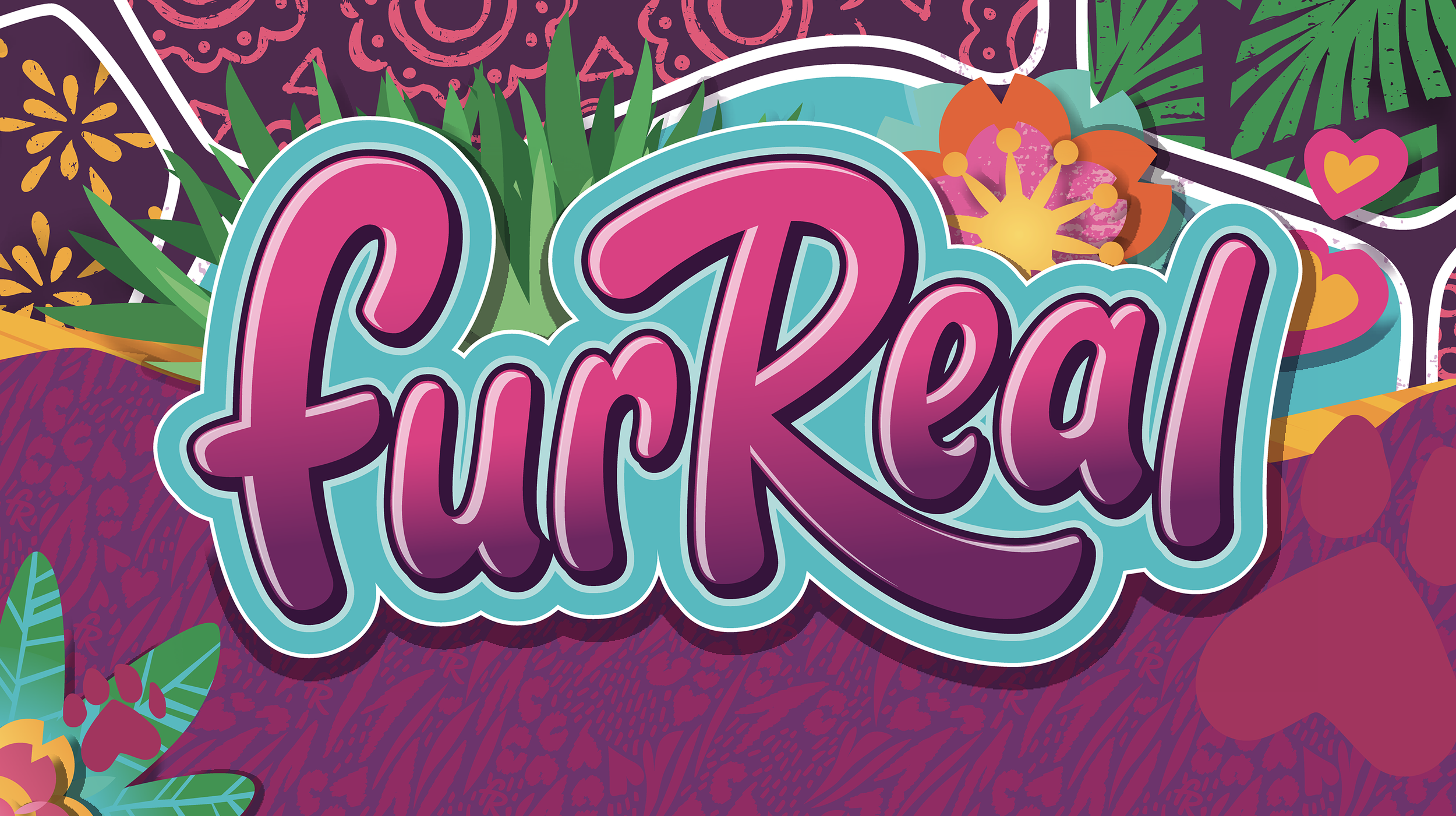
THE VISUAL LANGUAGE
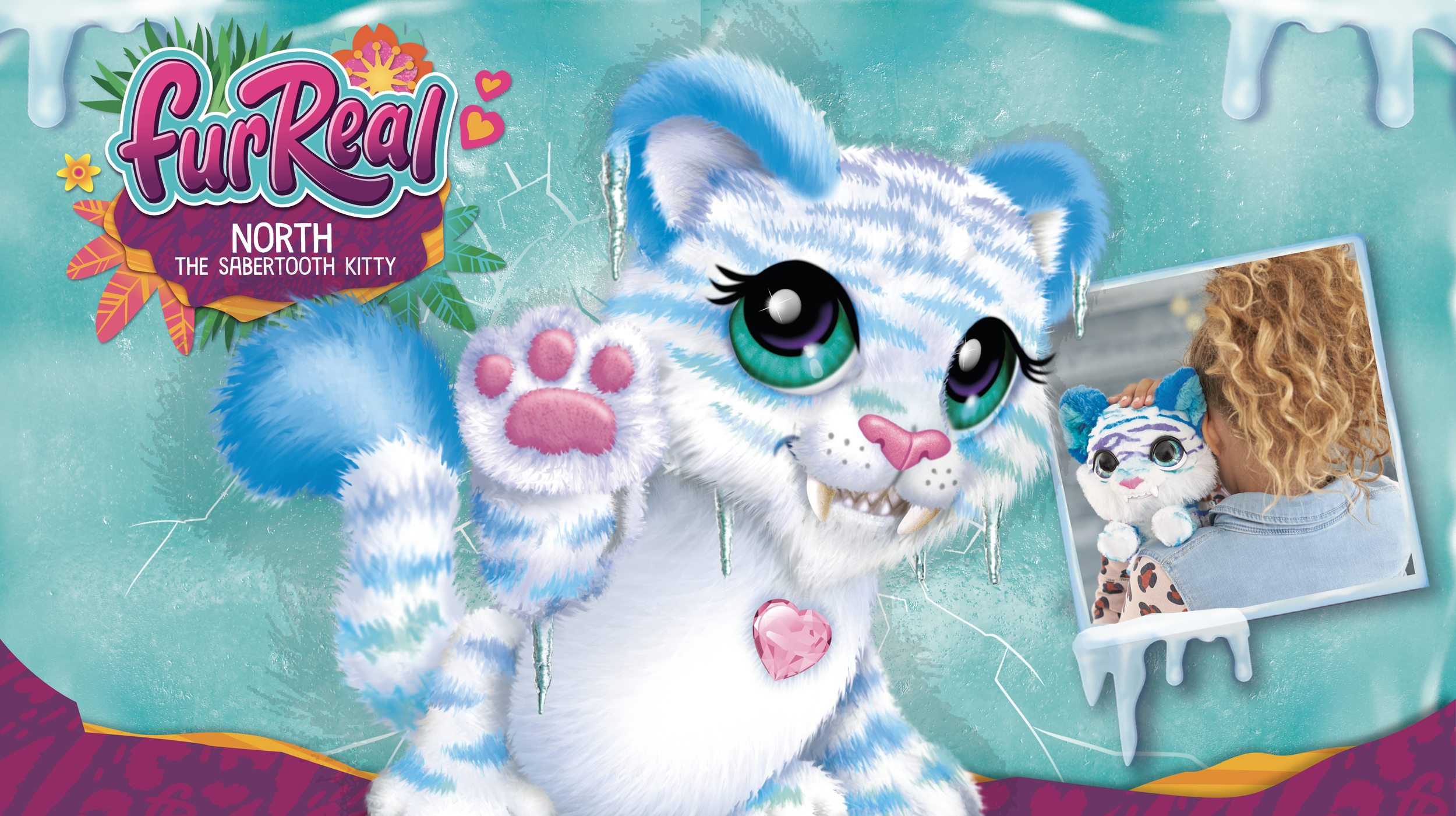
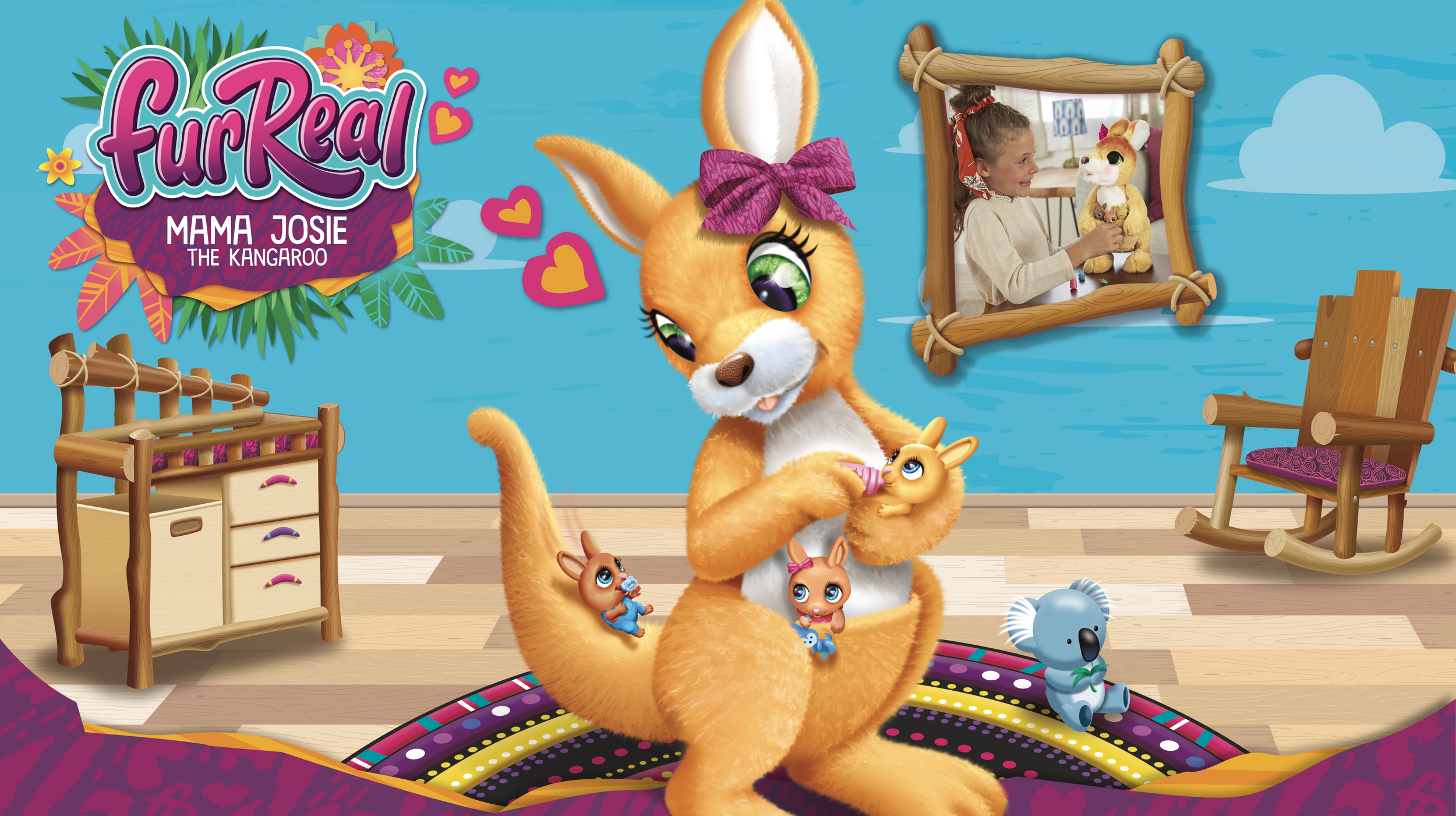
I created branding elements with own-able animal print patterns, paw prints and graphic elements, like hearts and foliage, in a ‘cut paper’ style. To modernize the brand I also redid the logo.
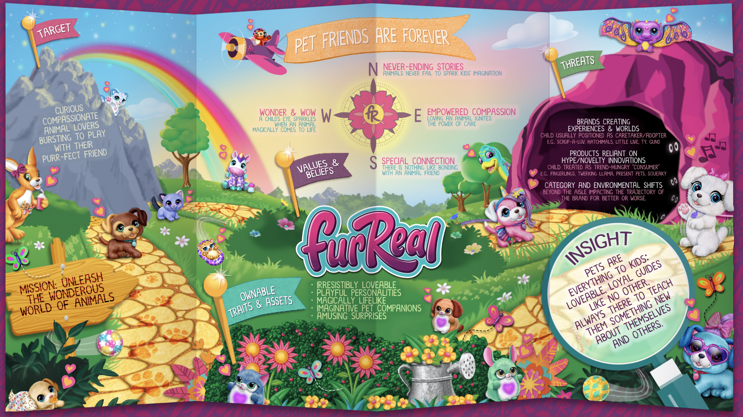
MAPPING OUT THE STRATEGY
After identifying what FurReal's core essence and core set of principles were, I established what made us stand out from the competition. I took those ideas and created a visual representation of our guiding strategy. With FurReal's future mapped out, I had a clear direction of where to take the brand and how.
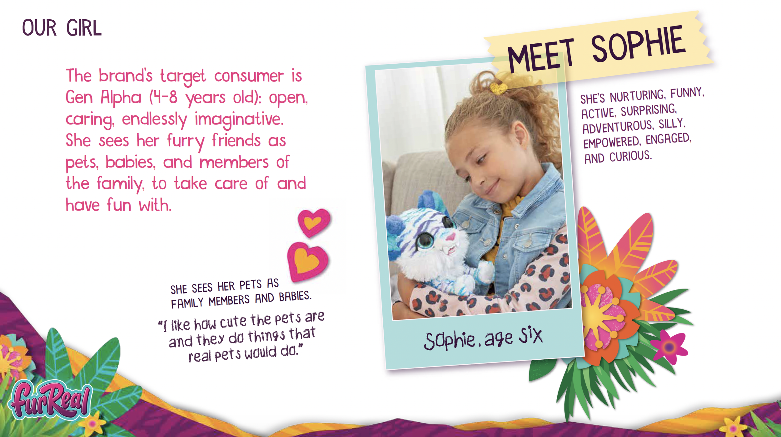
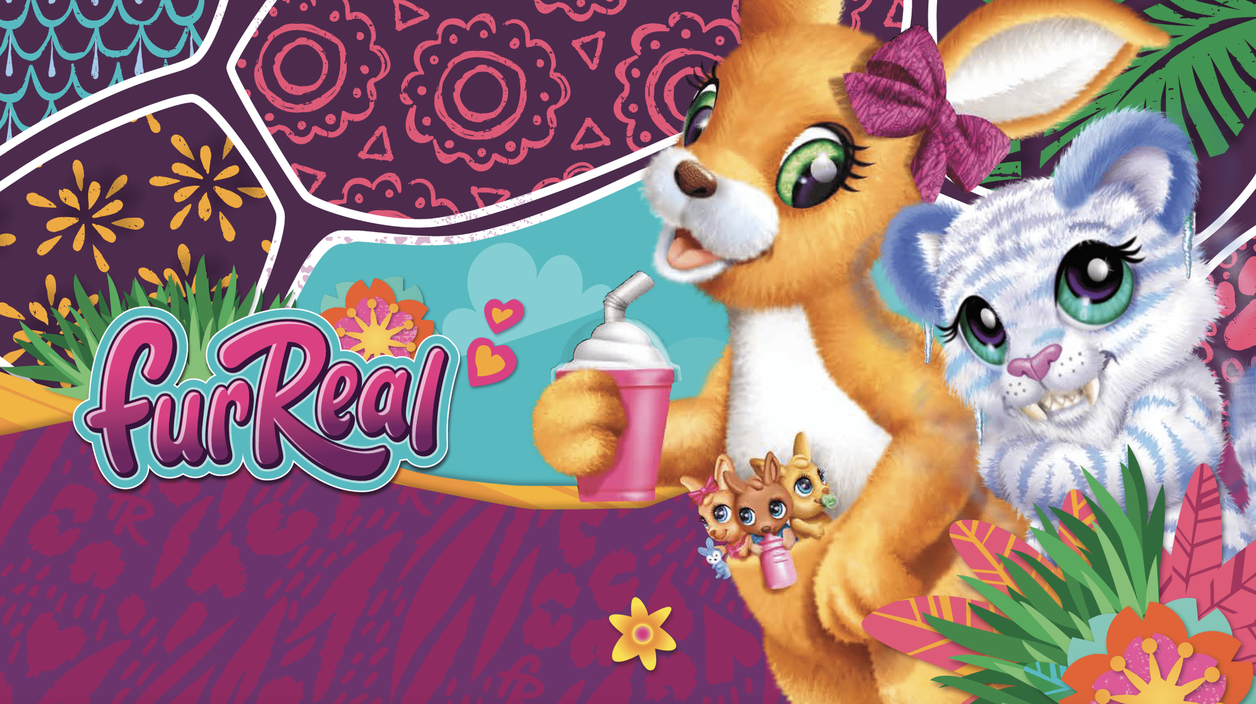
CORE CONSUMER
Identifying who the core consumer is allows designers to hone in on that target. Girls, 4-6 was FurReal’s target audience. In an aisle dominated by pink, purple was the best color choice to anchor the brand; to target those girls, while not alienating boys.
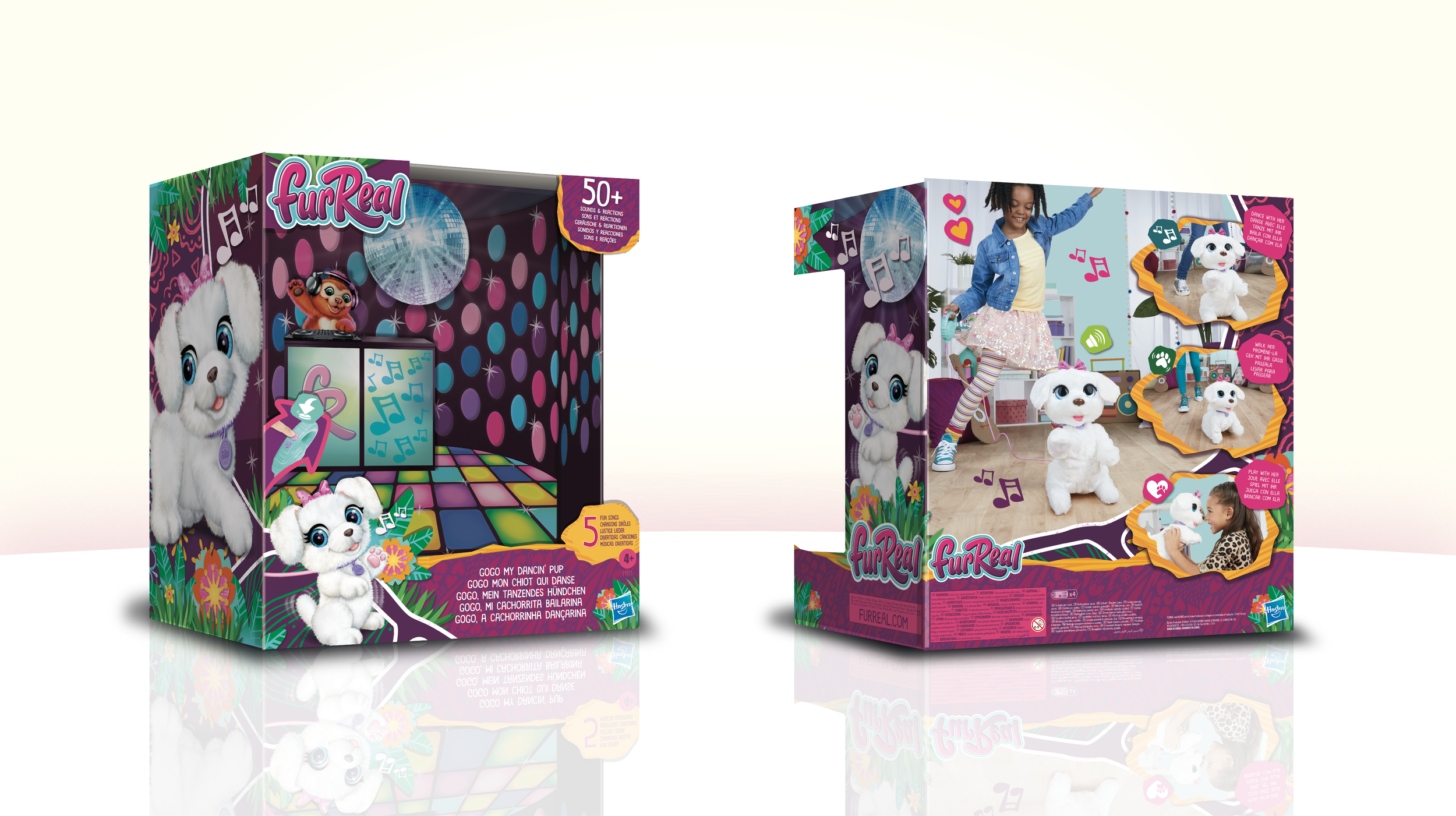
A STORY IN A BOX
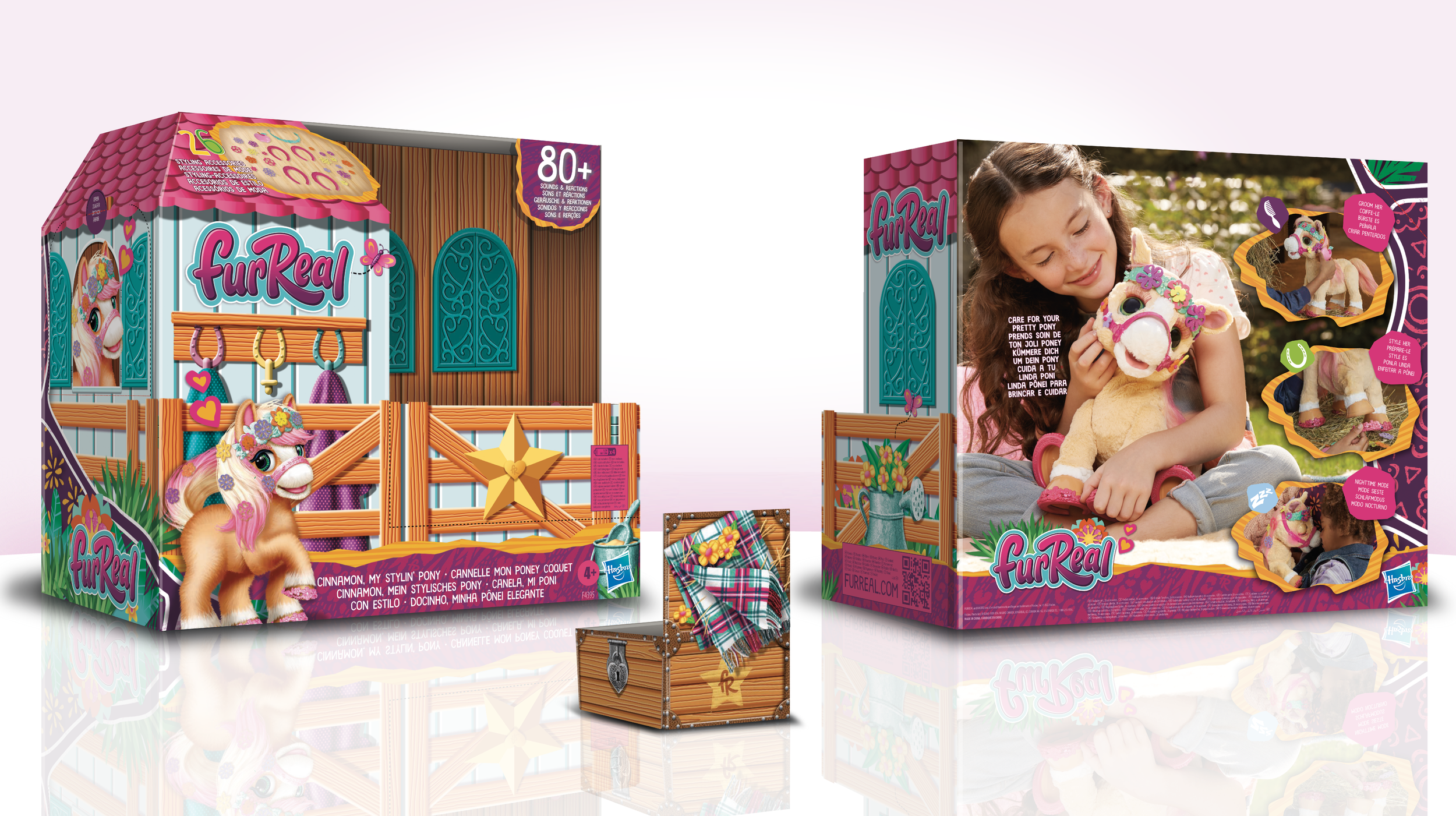
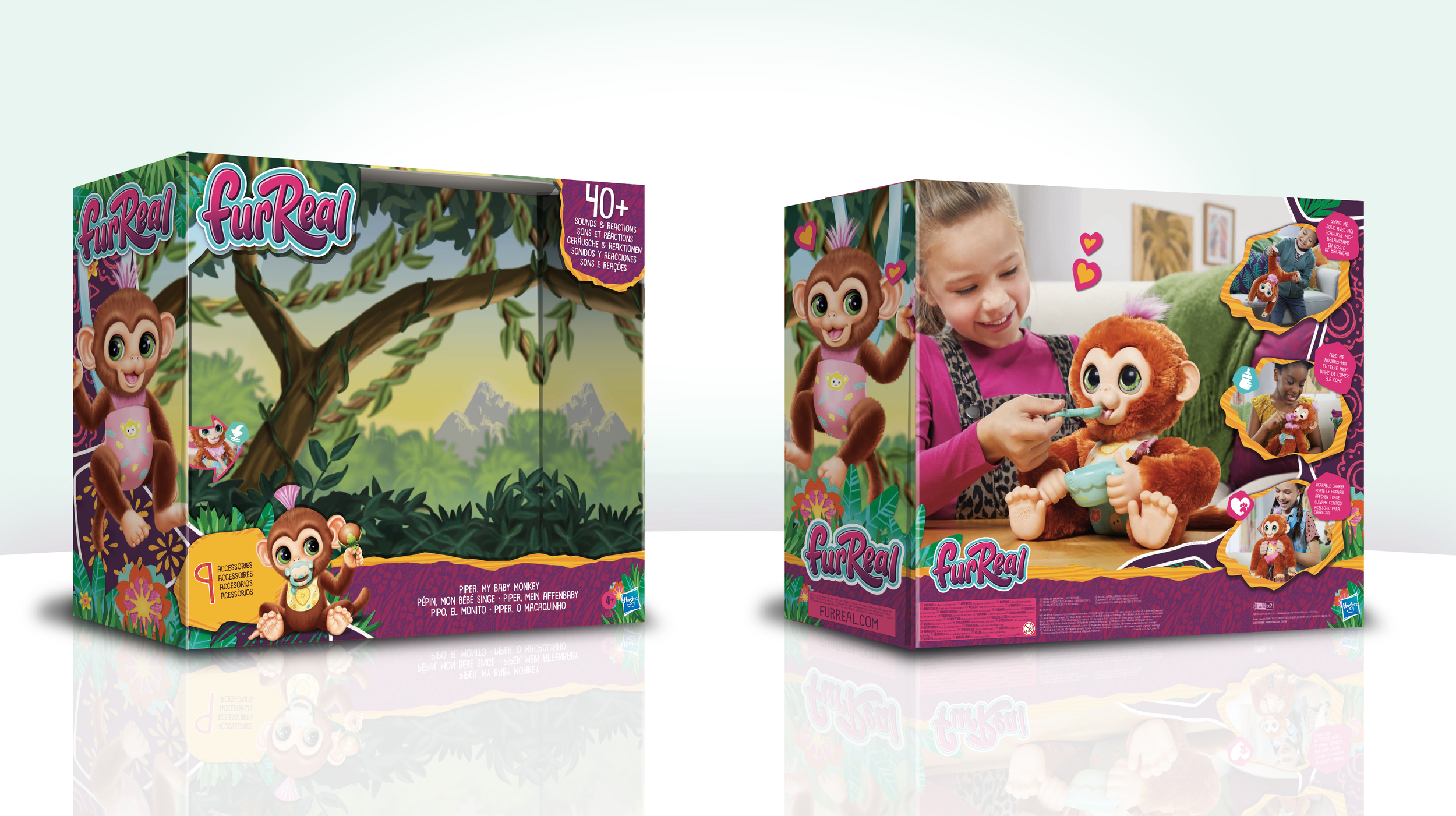
The next logical step was to create a consistent line-look by standardizing certain branding elements across the packaging, for a consistent, cohesive brand representation on-shelf. I also wanted to create a story for each toy pet by putting them in a fun environment that matched both the toy features and the type of animal.
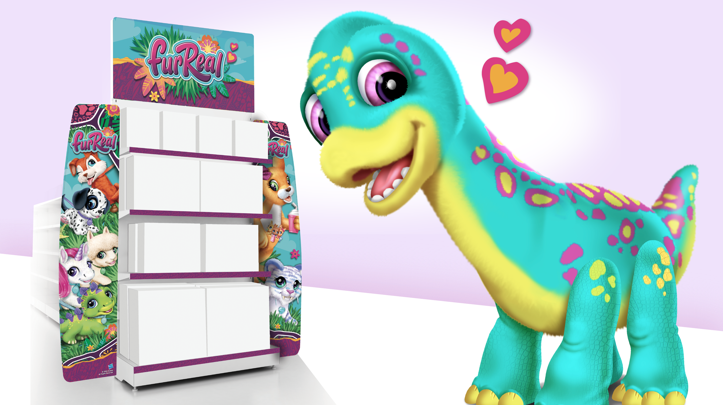
THE RETAIL EXPERIENCE
Once I had the packaging line-look set I extended out the branding to full retail displays.
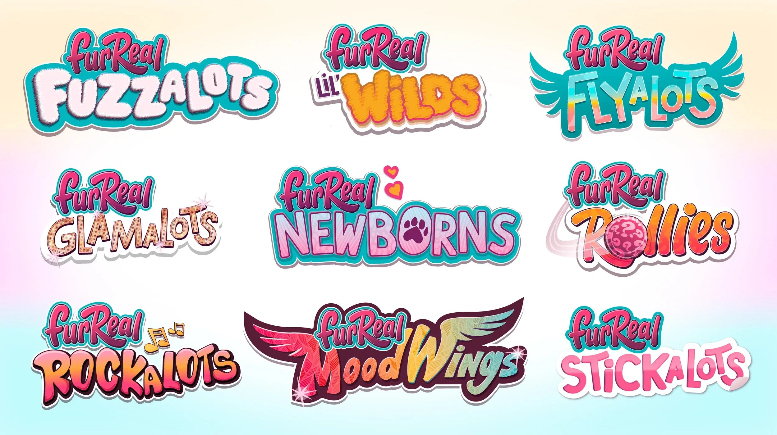
LED BY SEGMENTATION
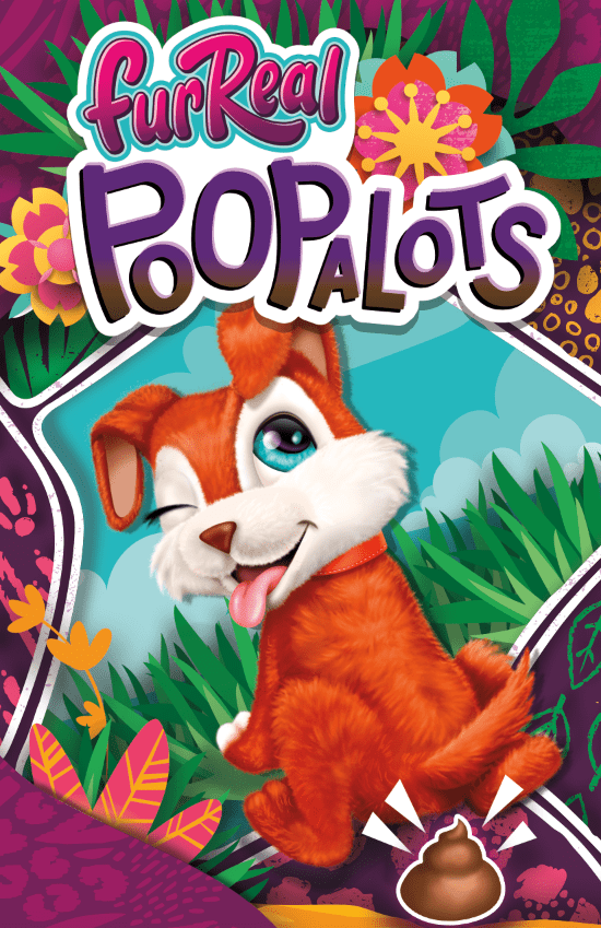
FurReal is a brand with many segments. Each segment needed a fun logo lock-up. So I created many logo lock-ups.
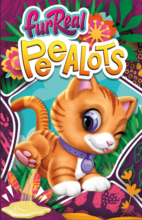
DESIGN IS FUN
I can’t take myself too serious. I enjoy all the steps in the process, from concept to completion. The segmentation approach was right for the brand at the time. It leaned into the personalities of each pet. FurReal Peealots & Poopalots were wildly a success. Turns out kids love potty humor. Designs led by insights tend to be the most successful.
The goal was to get FurReal back to an $80M IP.
Through this reimagined branding evolution, FurReal's sales improved dramatically (by just over 30% in the first year).
It had earned over $100M globally again.
Because of its success it started my journey as being the lead art director on many new branding initiatives at Hasbro.