
FURREAL REBRAND
THE CHALLENGE
Due to stagnation in the market, the FurReal brand became a candidate for a complete visual make-over. It didn’t just need minor tweaks, like the Peppa Pig project. It, like Furby, needed a completely new visual language system.
MY ROLE
Lead Brand Designer / Art Direction
THE SCOPE
Brand identity
Logo
Typography
Color palette & patterns
Illustration
Photography direction
Packaging
Retail
E-commerce
Digital
Social
Experiential & Events
Marketing Campaigns
Licensed Consumer Products
THE RESULT:


– MAPPING OUT OUR STRATEGY – After identifying what FurReal's core essence and core set of principles were, I had to establish what made us stand out from the competition. I then took those ideas and created a visual representation of our guiding strategy. With FurReal's future mapped out, I had a clear direction of where to take the brand and how.


– STRATEGIC CONSUMER TARGETING – I created assets and a visual approach that targeted FurReal's core consumer, girls 4-6 years old. I knew that I had to visually tell her stories, about our pets, for her to fall in love with them. So, I wanted to bring lots of fun & personality to our character illustrations and settings.


– A STORY IN A BOX – I wanted to create a consistent line-look by standardizing certain branding elements across the packaging, for a consistent, cohesive brand representation on-shelf. I also wanted to create a story for each toy pet by putting them in a fun environment that matched both the toy features and the type of animal.
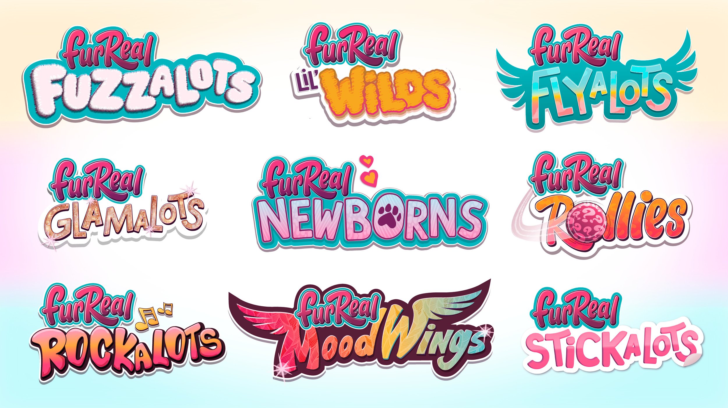
– LED BY SEGMENTATION – FurReal is a brand with many segments. Each segment needed a fun logo lock-up. So I created MANY logo lock-ups. Through this branding evolution, FurReal's sales improved dramatically (by just over 30% in the first year). It had become an over $100M global IP again. It was a success and it started my journey as being the lead art director on many new branding initiatives at Hasbro.